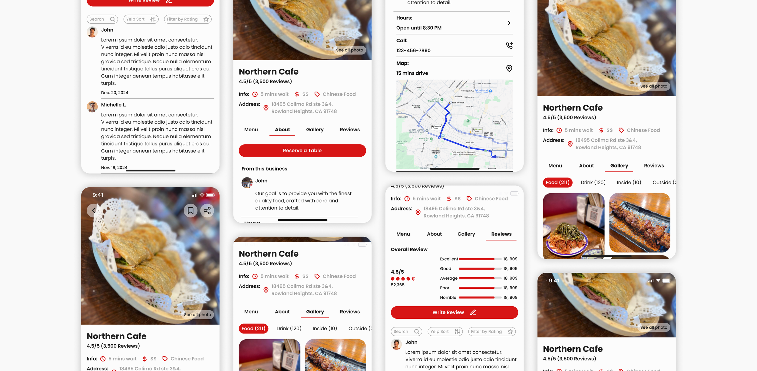
Elevate the Yelp Experience with a Neat and Organized Redesign.

OVERVIEW.
Yelp is a go-to app for exploring and discovering restaurant information, but through my research, I uncovered key user frustrations. People want quick access to menus, reviews, essential details, and the ability to make reservations—all in a seamless experience. However, the cluttered interface, with unnecessary duplicate buttons, creates confusion.
To address this, I took on the challenge of redesigning Yelp with a focus on clarity, neatness, and a well-structured hierarchy, delivering a more intuitive and enjoyable user experience.
Role: UI/UX Designer
Year: 2025
DISCOVERY.
INTERVIEW INSIGHS.
I felt confused when I would like to make a reservation; sometimes I have to scroll down to see where the reservation is, and it slows me down.
“
”
The interface is really messy, and I can never seem to find the buttons or sections I need. It feels like everything is all over the place.
“
”
Problems in the Current Version.
-

#1
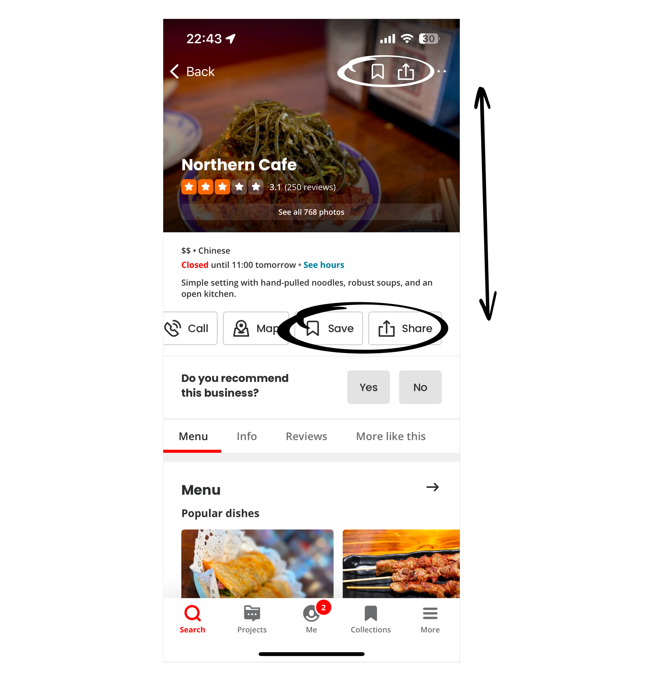
The buttons with the same functions are duplicated. Users can horizontally scroll to access the 'Share' and 'Save' buttons, which are also repeated at the top of the page.
-

#2
Multiple CAT buttons clutter the page, creating unnecessary duplication and overwhelming the user. This excess of buttons distracts from the core functionality and disrupts the user experience.
-

#3
Currently, the business culture section is placed at the bottom of the 'You Might Also Consider' section and above the reviews, disrupting the logical hierarchy. This misalignment makes it harder for users to navigate the content intuitively.
PROBLEM.
How to optimize information architecture, ensuring users can quickly access the information they need?
SOLUTION.
Streamline by organizing hierarchically and removing duplicates.
This approach declutters the design, making it easier for users to locate what they need without confusion or wasted time. By grouping related functions together in a logical and visually appealing way, the design not only enhances usability but also creates a more seamless and enjoyable experience. Simplifying navigation empowers users to interact with the app effortlessly, boosting efficiency and satisfaction.
PROCESS.
Information Architecture.
New Version Wireframe.
#1.
#2.
#3.


