Accessibility Design System.
Overview.
Accessibility is not just a checkbox in my design process; it’s a fundamental component of user-centered design. As a UX designer and researcher, I have a responsibility to create digital experiences that are accessible to everyone. By prioritizing accessibility, ensure that my designs are not only compliant and ethically sound but also innovative, inclusive, and beneficial to all users. This commitment to accessibility is not just good design practice; it is good business, good ethics, and, most importantly, the right thing to do.
Role: UX Researcher & UI Designer
Year: 2023

Research.
Globally, over 38% of the population, or approximately 3 billion people, are affected by some form of visual impairment.
This includes around 2.7 billion people (33.8% of the world population) with uncorrected refractive errors such as nearsightedness, farsightedness, and astigmatism. Additionally, about 295 million individuals (3.7%) experience low vision that cannot be fully corrected with standard glasses, contact lenses, or surgery, and roughly 43 million people (0.5%) are blind. Color blindness also affects around 300 million people (3.8%), with red-green color blindness being the most common. These statistics underscore the widespread impact of visual problems globally and the need for accessible healthcare services, assistive technologies, and inclusive design to support those with visual impairments in daily life.
Examine the number of individuals with visual impairments in each country.
Global prevalence of visual impairments
(hover to view the data)
Prevalence of visual impairments in the United States
(hover to view the data)
Color Study.
#f5f5f5
#dadada
Contrast with white:
1.1
Contrast with white:
1.4
#3a3a3a
#1e1e1e
Contrast with white:
11.4
Contrast with white:
16.7
#c0d6ef
#004eaa
#f4c03a
Contrast with white:
1.7
Contrast with white:
9.6
Contrast with white:
1.3
Light Theme.
Button
Button
Color Contrast:
7.21
Color Contrast:
10.43
Button
Button
Color Contrast:
8.14
Color Contrast:
7.64
Button
Button
Color Contrast:
15.29
Color Contrast:
11.93
Button
Button
Color Contrast:
11.20
Color Contrast:
9.88
Dark Theme.
Button
Button
Color Contrast:
10.43
Color Contrast:
15.29
Button
Button
Color Contrast:
7.21
Color Contrast:
8.14
Button
Button
Color Contrast:
11.93
Color Contrast:
7.64
Button
Button
Color Contrast:
9.88
Color Contrast:
11.20
Guideline for Button Design in Mixed Theme Interfaces:
When using a dark-themed button on a light background, it’s essential to add a 2px stroke around the button. This additional stroke helps improve the contrast between the button and the background, ensuring that it meets the accessibility requirements set by the WCAG (Web Content Accessibility Guidelines). Proper contrast is crucial for readability and accessibility, particularly for users with visual impairments.
Iconography.
To meet accessibility requirements, the stroke of an icon should be at least 2 pixels thick. This minimum thickness helps ensure sufficient contrast, making the icon easily distinguishable and readable for visually impaired users. A thicker stroke not only enhances visibility but also improves the overall clarity of the icon, particularly in environments with low light or for users with varying levels of vision. Consider the stroke thickness and contrast ratio to ensure they are accessible to all users.
Text Design.
Typography is a critical element in creating an accessible website for all users, regardless of their abilities. Using an accessible typeface helps ensure that individuals with disabilities or impairments can easily read and engage with online content. It is important to maintain appropriate color contrast between the text and its background to meet WCAG standards: a minimum of 4.5:1 for small text and 3:1 for large text. Additionally, avoid using pure black (#000000) against pure white (#FFFFFF), as this combination can create eye strain and reduce readability for some users.
Heading 1: Around 22pt to 28pt for desktop/large screens, 18pt to 24pt for tablets/medium screens, and 16pt to 22pt for mobile/small screens.
Heading 2: Generally smaller than H1, with sizes around 18pt to 24pt for desktop/large screens, 16pt to 20pt for tablets/medium screens, and 14pt to 18pt for mobile/small screens.
Heading 3: Around 16pt to 20pt for desktop/large screens, 14pt to 18pt for tablets/medium screens, and 12pt to 16pt for mobile/small screens.
H4, H5, H6: These can decrease in size incrementally, ensuring readability while maintaining contrast.
Paragraph text - The minimum expected font size is usually 14 points, but 16 points can improve readability for most people, including those with visual impairments or disabilities. It’s considered best practice to avoid using bolded, italicized, or otherwise stylized fonts to convey meaning, and having the right balance of contrast is important
Fallback Font.
Why Fallback Fonts Are Necessary?
Fallback fonts are essential in digital design to ensure a consistent and accessible user experience across different devices, browsers, and user settings. They provide a backup option if the primary font fails to load, ensuring that text remains readable and the design maintains its integrity. Using fallback fonts to enhance performance, improve accessibility, and deliver a reliable user experience.
Atoms.
Color picker.
Default.
Focus.
Disable.
Progress Indicators.
Default.
Focus.
Disable.
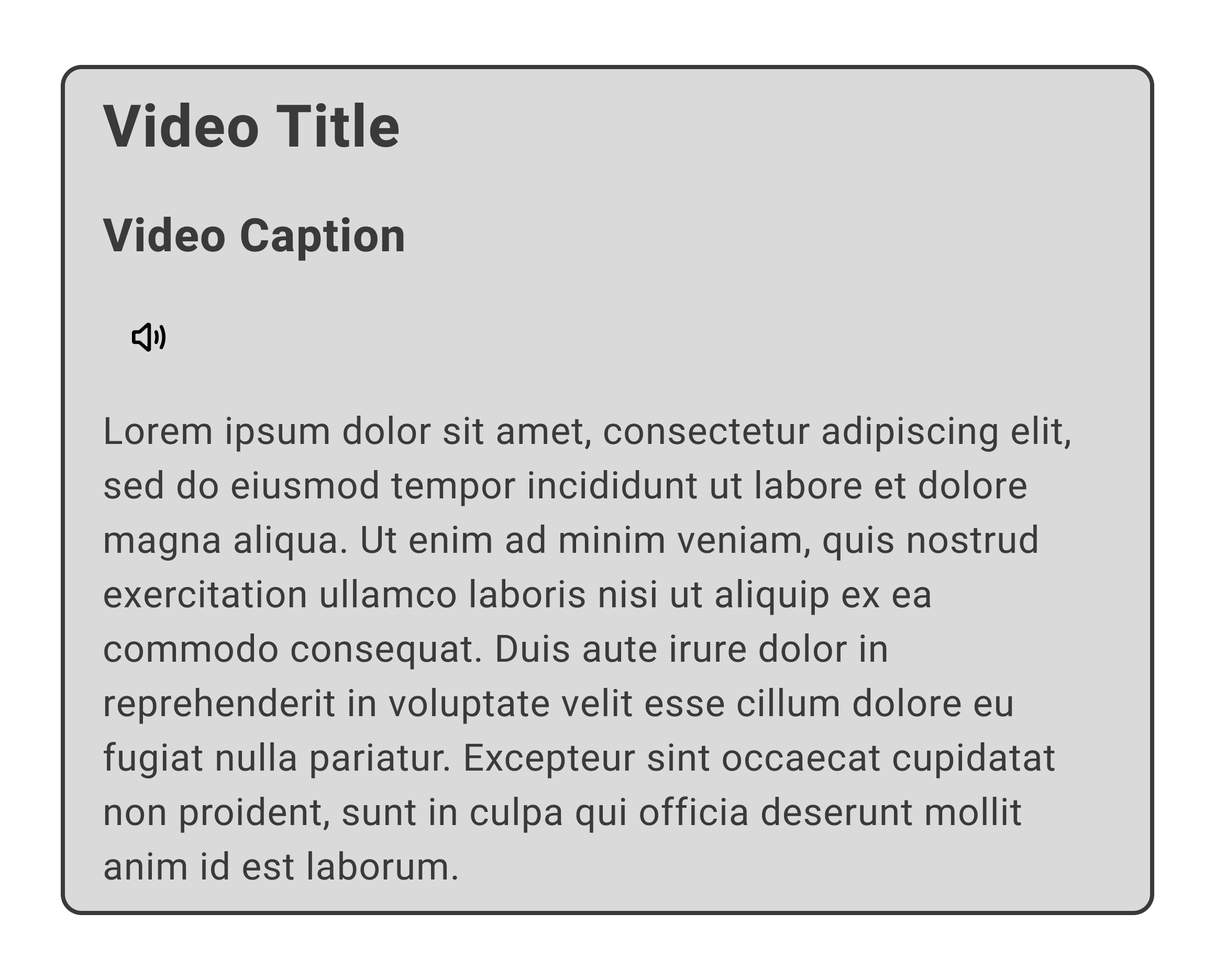
Video Caption.
Default.
Focus.
Disable.
Interactive Chart.
Default.
Focus.
Disable.
Interactive Atoms.
Interactive Form.
To create an inclusive and accessible design, every input field is properly integrated with screen readers and speakers. Ensuring that screen readers can announce the purpose and state of each input field provides essential guidance to users with visual impairments or other disabilities who rely on assistive technologies.
Dropdown Menu.
The screen reader will activate when the dropdown menu is clicked. This design is essential for users who rely on screen readers, as it helps them understand changes in the interface and navigate more effectively. Improving usability for people with visual impairments ensures that the design meets accessibility standards, making it more inclusive for all users.
Accordions & Buttons.
When designing accordions and buttons, it is crucial to ensure there is sufficient contrast between the accordion elements and the background. This contrast is essential for making the content easily distinguishable and readable, especially for users with visual impairments or color vision deficiencies. Proper contrast improves accessibility and creates a more user-friendly experience for people with disabilities.


